The Third Chapter of the UX Design Playbook
The world of UX Design is filled with various strategies for shaping high-quality and impactful user experiences. It’s a playbook, and this blog post is its third chapter. One blog post at a time, a new game tactic is revealed, building a UX knowledge field where we control every position and condition with the patterns from the playbook. This chapter adds an aspect to our game that few UX designers truly master—writing and content design.
Why Is UX Writing Important?
A UX designer’s role is to create an interface that is understandable to the user. An interface consists of various content areas, interactive components, color choices, and user flows. The element that connects all these together is text content—every interface contains text. It appears in buttons, forms, menus, articles—everywhere.
For users who rely on screen readers, text is the primary way of interacting with an interface. Given this, it’s easy to conclude that an interface cannot be truly usable if its text is not clear and understandable. Yet, I often encounter situations where writing is considered an afterthought, and usability is believed to come solely from component choices. That’s simply not the case.
Text is a fundamental part of usability, and every designer—regardless of their role—should understand the key principles of writing effective UX copy. The best learning opportunities come from real-world situations, so I’ve gathered examples from my own experience where improving text content has significantly enhanced user experience. After that, we’ll review the essential principles for creating clear and user-friendly text.
Avoid These UX Writing Pitfalls
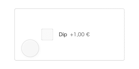
Framing Choices in a Negative Way

While this type of checkbox and accompanying text is commonly used, it creates a cognitive conflict for the user. The checkbox means selecting an option, but the text is framed as rejecting something. The user must mentally process, “I am selecting that I don’t want dip.”
A better approach is to phrase options in a positive way, making the choice intuitive:
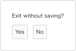
Another example of negative phrasing causing confusion is in confirmation dialogs for leaving a form:
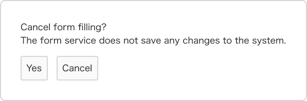
This option is nearly impossible to use. If the user selects “Yes,” they confirm canceling the form submission. If they select “Cancel,” they cancel the cancellation of the form submission. Sounds confusing, right?
Even if the options were “Yes” or “No,” it wouldn’t fully solve the problem. “Do not cancel the form submission” would still be too complex due to the double negative.
A much simpler approach would be to ask the user to confirm what they want to do, not what they want to cancel.
Overly Complex Instructions
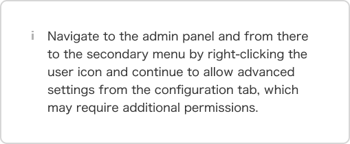
This buries the user in complexity—it crams eight different steps into a single sentence. Wouldn’t it be simpler to provide a direct link to the relevant setting?
A general UX rule is: If an interface requires detailed instructions, the design has already failed. Interfaces should guide users naturally through clear layouts, intuitive flows, and contextual hints. As Elon Musk famously said, “The best component is no component.” Similarly, “The best instruction is no instruction at all.”
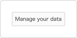
Poor or Illogical Headings
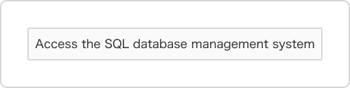
Headings are powerful tools for making content easier to scan. But when they fail, they confuse rather than clarify.
Users don’t need to know how the system works in the background; they just need clear actions from their own perspective.
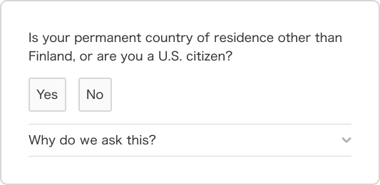
Business, System, or Regulation-Driven Language

Poor UX copy often prioritizes corporate or regulatory concerns over user needs.
The previous example touched on this issue, but I want to highlight it as its own category because it is the most common design flaw leading to poor outcomes in text content. Just like any other part of the interface, text should be user-centered.
In the example above, the user is overwhelmed with regulatory text before they are allowed to answer a question—one that is already phrased in a way that requires unnecessary mental effort.
Once again, the buttons “Yes” and “No” are intuitive and easy to use, but the surrounding text reduces usability and accessibility. All of this information can be communicated to the user, but in a simpler and more focused way that does not distract them from what matters.
In this scenario, the user’s main goal is to move forward, so the most important thing is that they clearly understand what they are being asked and how to respond—not how regulations impact the company they are interacting with.
Vague or Ambiguous Wording
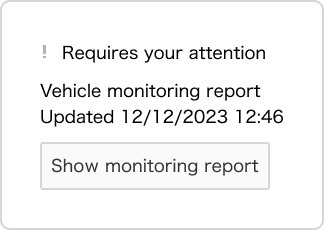
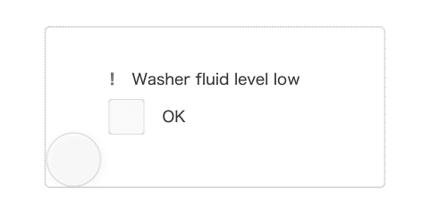
In this example from a car’s user interface, the issue highlighted in the monitoring report is low windshield washer fluid. However, the generic message “Requires your attention” creates the impression that there might be a serious problem with the car.
Vague wording leads to unnecessary cognitive effort, stress, and makes it harder to identify and fix the root cause of the issue.
This example also presents two usability problems beyond unclear language:
- The root cause of the error cannot be resolved through the interface itself, meaning opening the report is unnecessary work for the user.
- The message could take up less space by displaying the issue directly in the monitoring report. Since this is not a critical issue, the user should also have the option to simply dismiss the notification.
Unclear wording often results from applying a generic solution too broadly across different use cases or failing to consider the user’s perspective in the design process.
If an action is required from the user, it should be clearly stated, and the steps to resolve it should be easy to follow. This requires extra effort in the design phase, but the end result is always worth it.
Walls of Text
Writing long text takes ten times less effort than refining it into a concise and clear version while eliminating unnecessary content. This is why we often encounter interfaces filled with walls of text.
The root cause of text overload is usually a lack of effort in UX writing, designers focusing on something other than user needs, or sometimes just plain laziness. Have you ever heard anyone say about a mobile app or website, “It was easy to use because it had enough text?” Or “I wish there was more text here?”
It’s hard to define an exact threshold for what qualifies as a wall of text, but the nature of the interface itself provides some guidance. Longer text is acceptable in articles, but in interactive interfaces, less text and more action is generally the better approach.
UX writing pitfalls also include unclear or incomplete text, redundancy, grammatical errors, translation mistakes, lack of usability testing, and many others.
So, instead of just identifying problems, let’s shift our perspective and focus on how to avoid these mistakes.
The UX Writing Playbook – Key Strategies
Creating effective UI text is not rocket science, but it does require discipline. Here are the core principles to follow:
1. Use Clear and Concise Language
✅ Choose straightforward words and simple sentence structures
✅ Avoid jargon, technical terminology, and complex compound words.
✅ Avoid redundancy.
✅ Avoid vague wording.
✅ Make sure all text is precise and accurately conveys the intended meaning.
✅ Phrase UI text using positive choices.
✅ Use verbs in action-related headings.
2. Use as little text as possible
✅ Determine the minimum amount of information the user needs to navigate the interface comfortably. Do not add any extra text beyond that.
✅ Do not mix technical, regulatory, or business jargon with essential user-facing text.
✅ Ensure the interface is intuitive enough on its own and does not require additional explanations.
3. Write from the User’s Perspective
✅ Design text so that anyone can understand it.
✅ Test the interface with real users from the target audience to ensure they comprehend the text content.
✅ Make sure the user clearly understands if an action is expected from them.
✅ Ensure that the text is meaningful to the user and presented in a logical order.
✅ Write text that describes actions from the user’s perspective in a logical way.
✅ Do not unnecessarily mix the inner workings of the system with what is expected from the user.
Bringing UX Writing Excellence to Your Product
If every company followed these UX writing principles, the usability of apps and websites would improve dramatically.
At Teamit, we have helped e.g. financial sector clients navigate regulatory complexity without compromising user experience. With our design services, you can create exceptionally usable, accessible, and engaging applications—including well-crafted, clear UX writing.
We offer the expertise of UX writers, copywriters, content designers, and content producers to help you craft the best possible experience for your users.
👉 Need better UX writing? Let’s talk! 🚀